Laura Torres
The Trailblazer
Hi! I’m a graphic designer that loves motion design. I love to take inspiration from everything around me and consider myself a collector. I pride myself in being able to come up with innovative ideas quickly.

Aespa Poster
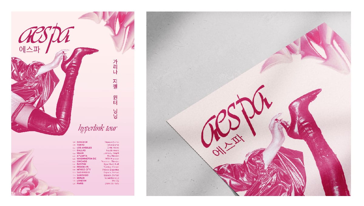
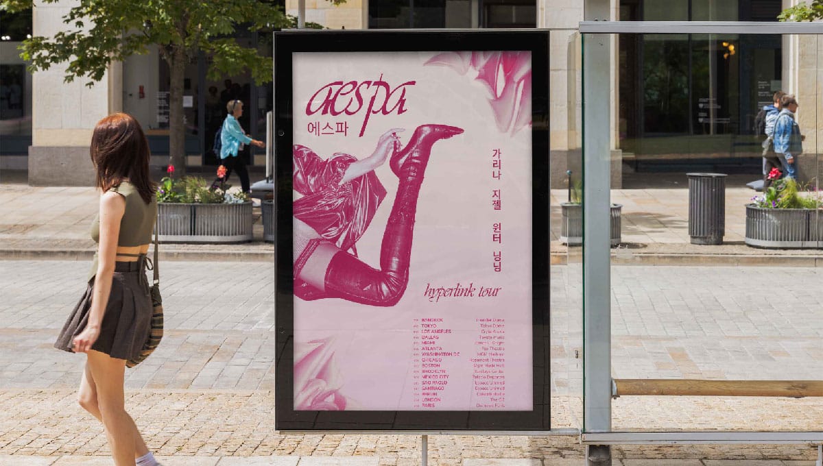
This poster celebrates Aespa’s 2023 Hyperlink World Tour. To emphasize the femininity and strength of this group, this poster incorporates soft and deep pinks. There is also an emphasis on geometric and organic symbols and patterns. The Korean letters on the poster are hand drawn and designed to match the typeface chosen for the English typography.
Aqua Logo and Labels
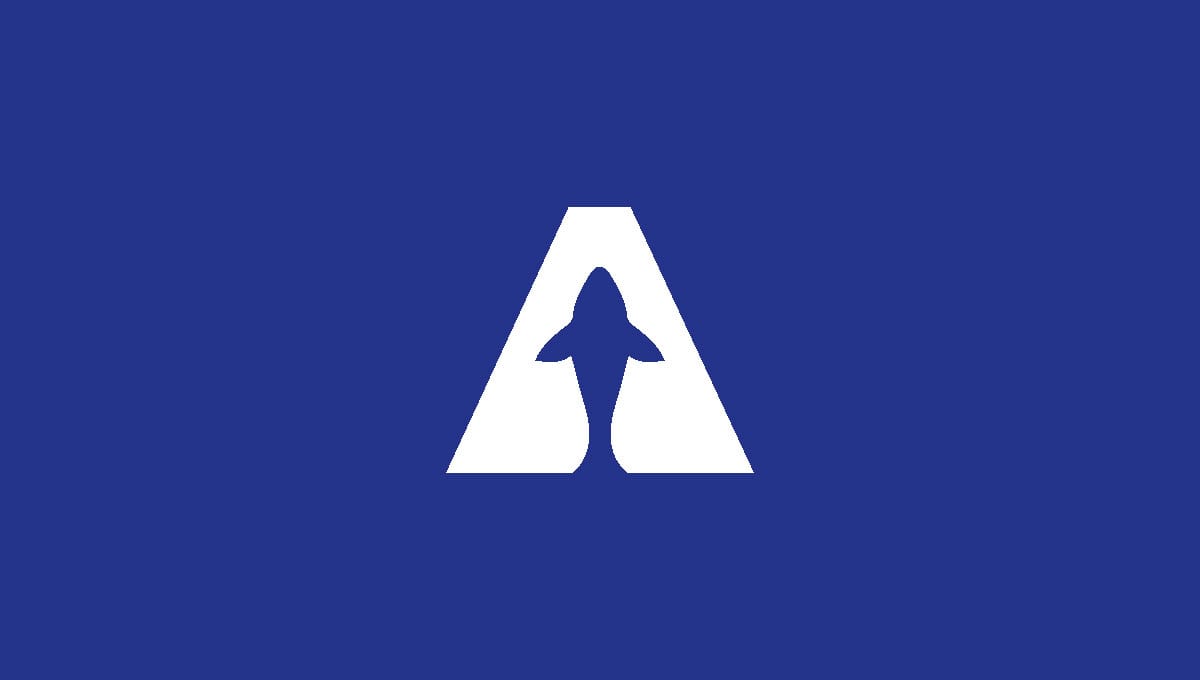
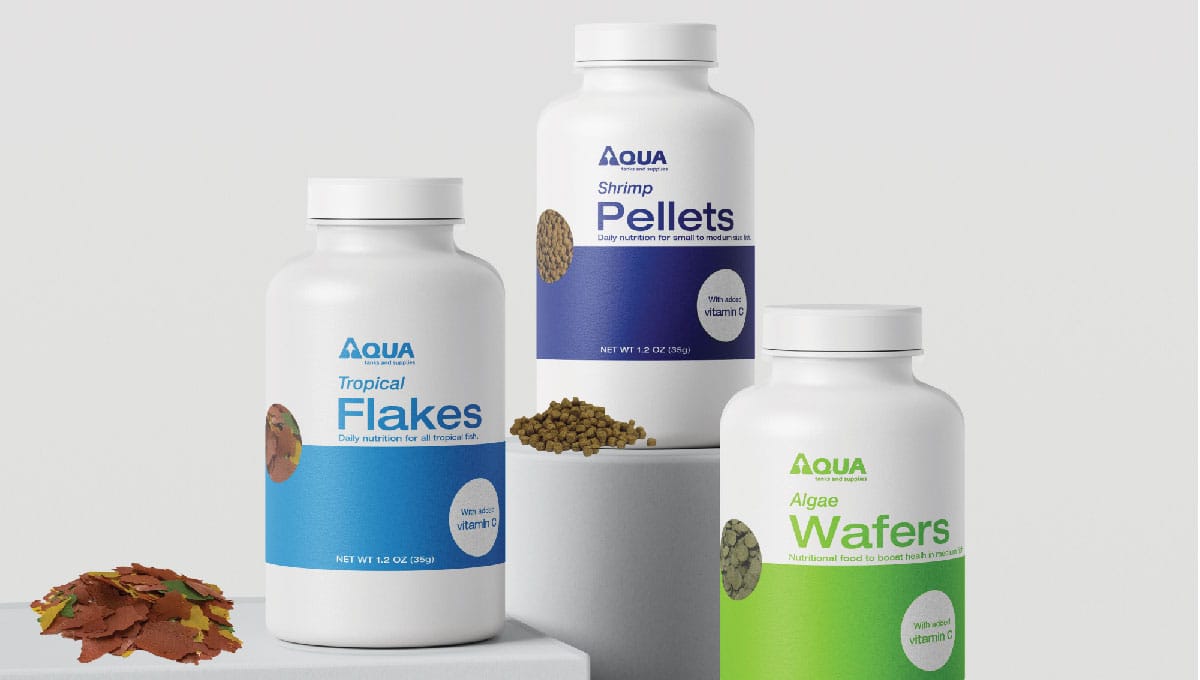
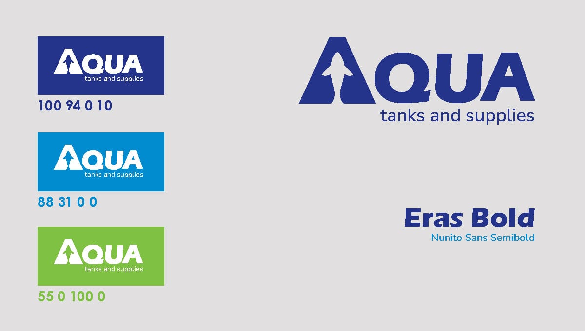
Aqua sells supply for aquarium owners. The counter form of the letter “A” is created by a fish silhouette. The fish is not enclosed entirely by the “A”; to indicate the freedom the fish will feel in a well-maintained tank. The letterforms have sharp corners and all caps to form a rectangle much like a fish tank. The colors represent the variety of aquatic life that can be cared for with Aqua products.
Beep Boop Package Design
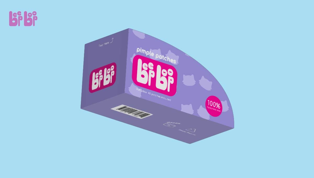
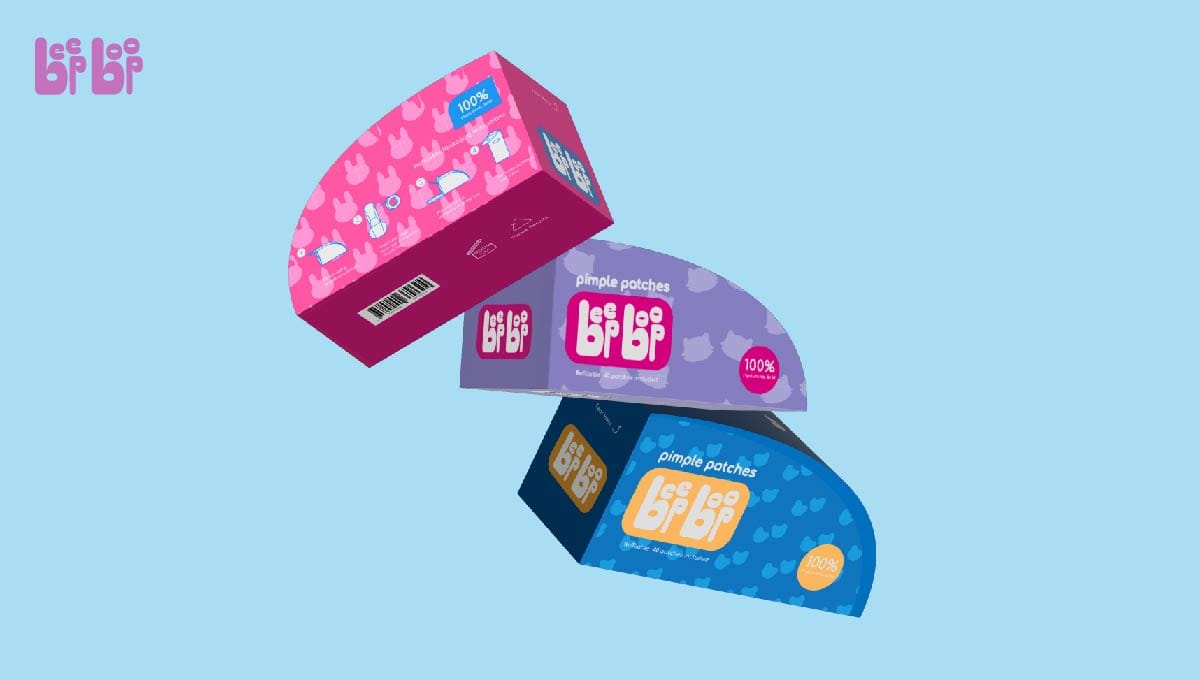
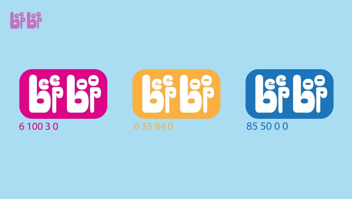
Beep Boop is a pimple patch brand that targets young women. The patches have cute animal shapes to create an interesting experience for consumers. Normally pimple patches are sold with lots of plastic packaging. The packaging for Beep Boop’s patches aims to be environmentally friendly by eliminating plastic. This is achieved by creating a wax paper tape roll that dispenses and protects the patches. The roller is portable and refillable to encourage consumers to reuse the packaging. The playful logo reflects the name and bright color choices allow the package to be engaging and stand out on the shelf in comparison to other skincare brands that tend to use a minimal style.


